Network Structures, Polarization, and Dynamics of Political Preferences in 2025 Race to be New York City’s Next Mayor
This analysis presents a comprehensive study of the digital political landscape of the New York mayoral elections based on social media data, including Facebook, X, TikTok, and Instagram. The research examines network structures of interests, distribution of political preferences among candidates, and mechanisms of digital echo chamber formation in the context of an electoral campaign. The analysis is based on data on candidate followers and their followings (interests) collected from major social platforms and uses network analysis methods to visualize and interpret the political preferences of New York residents.
Key Findings:
● **Mamdani’s victory over the more well-known Andrew Cuomo in the Democratic primaries was fully predictable based on digital social media data, which demonstrated his total dominance in digital space long before election day.
● The digital political field consists of isolated echo chambers with U-shaped polarization, where voters demonstrate virtually no mixed preferences between candidates—people are either completely within one candidate’s ecosystem or completely within another’s.
● Andrew Cuomo’s unexpected dominance among Republicans further underscores the skew of social networks toward younger and more progressive audiences. Many moderate Republicans, unwilling to back Sliwa’s hardline stance, shifted toward Cuomo as a pragmatic centrist alternative.
● Cuomo secured second place not by appealing to audiences with clearly defined red or blue interests — Republicans or Democrats respectively — but by attracting people with only one or two political interests and no strong partisan alignment on social media, those who occupied a central gray position in the digital landscape.
● The data reveal that the traditional concept of the “gray zone” must be redefined. It does not consist of balanced 50/50 centrists — who are almost nonexistent among politically engaged users — but of people with few or weakly expressed political interests. These low-engagement users form the true gray zone: a large, mobile audience that can be activated not through persuasion between poles, but by expanding or creating new interest connections.
● Andrew Cuomo emerges as the undisputed king of the gray zone: his followers demonstrate significantly fewer political interests (26.9 on average) compared to Mamdani’s followers (53.1) and Sliwa’s followers (43.3), despite having similar numbers of total followings. This pattern cannot be explained by overall social media engagement levels, confirming that Cuomo’s centrist position systematically attracts voters with lower political interest—the very demographic that constitutes the largest and most mobile segment of the electorate.
● The analysis reveals that network analysis of digital traces can provide more accurate predictions of electoral outcomes than traditional methods, and that elections in the digital age represent not a struggle to win over undecided voters, but a race to mobilize one’s own clusters and capture neutral gray zones. The study focuses on New York residents who have at least one colored interest, which represents approximately 3 million people, or about 35% of the city’s population.**
Terminology and Methodological Concepts
To understand the subsequent analysis, it is necessary to define the key terms used in this study.
Colored Interests (Marked Interests)
Colored interests represent categories of interests or topics in which a specific candidate has dominant representation among followers. An interest is considered colored in a candidate’s color when more than 65% of followers of that interest are followers of that candidate. This means that the candidate has significant influence on that topic and that people interested in that topic are more likely to be followers of that candidate.
The color scheme for coloring interests corresponds to the following candidates: • Blue color — interests colored in favor of Zohran Mamdani • Red color — interests colored in favor of Curtis Sliwa • Green color — interests colored in favor of Andrew Cuomo • Gray color — neutral interests that are not colored in favor of any candidate, meaning no candidate has more than 65% of followers in that interest
The 65% coloring criterion was chosen as a threshold value that allows identifying interests where a candidate has clear dominance, while accounting for the possibility that some interests may be shared among several candidates. If none of the candidates reaches the 65% threshold, the interest remains gray, indicating its neutral nature or that it is shared among several candidates without clear dominance by any one of them.
It is important to note that coloring an interest in a certain color does not mean that all followers of that interest support the corresponding candidate, but indicates a strong correlation between interest in that topic and following that candidate. This allows identifying the structure of political preferences and identifying topics that are key to mobilizing support for each candidate.
The study focuses on New York residents who have at least one colored interest, which represents approximately 3 million people, or about 35% of the city’s population. This subset of the population demonstrates active engagement with politically relevant topics and provides a representative sample for analyzing digital political preferences and candidate affiliations.
Analysis of Candidate Accounts
To begin, it is worth noting the uneven distribution of follower numbers among candidate accounts on social media. For example, on Instagram, the @zohrankmamdani account has an order of magnitude more followers than other candidates. This uneven distribution creates a methodological problem when comparing candidates, as differences in audience size can distort the analysis results.
To solve this problem and ensure fair comparison between candidates, a method of equal sampling of followers was applied. This means that for each candidate, an equal-sized random sample of followers was selected, with the sample size for each candidate being 14,000 followers. This approach allows comparison of their political followings without the influence of differences in audience size, ensuring the validity of comparison and enabling identification of structural differences in the organization of preferences among candidates, regardless of the size of their digital presence.
Digital Knockout: Predictability of Mamdani’s Victory over Cuomo
The hypothesis suggests that the results of the Democratic primaries, where Mamdani won over the more well-known Andrew Cuomo, were fully predictable based on analysis of the digital landscape of social media. Despite the fact that for many offline analysts this victory came as a surprise, social media data demonstrated Mamdani’s total dominance in digital space long before the vote.
This hypothesis challenges traditional methods of electoral analysis based on polls and historical data, and suggests that network analysis of digital traces can provide more accurate predictions of electoral outcomes.
Evidence and Analysis
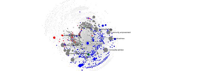
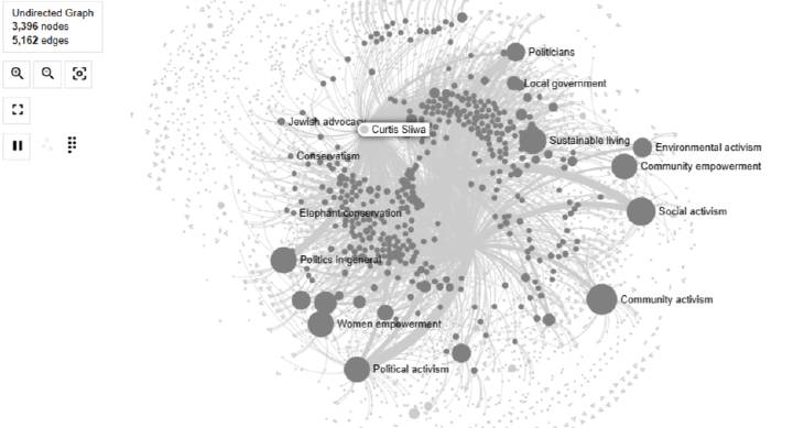
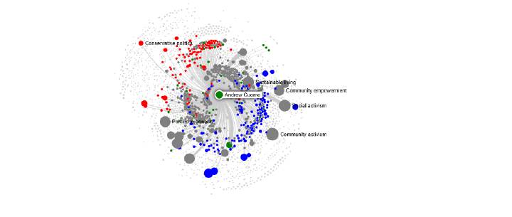
The research begins with analysis of the network graph of interests. Network graphs are visualizations where each node represents either an interest or category of interests, or a blogger, and edges (connections) between nodes reflect correlations between candidate followers and these interests, as well as connections between bloggers and the interests they cover. The graph is constructed by positioning nodes in a two-dimensional space using force-directed layout algorithms, which place strongly connected nodes closer together and weakly connected nodes farther apart. Node size corresponds to the reach of the interest among New York residents, and connection thickness shows the strength of the candidate’s influence on that interest. Nodes are colored according to which candidate has dominant representation (more than 65% of followers) in that interest: blue for Mamdani, red for Sliwa, green for Cuomo, and gray for neutral interests where no candidate reaches the threshold. Bloggers are represented with dark versions of these colors (dark blue, dark red, dark green, or dark gray) to distinguish them from interest nodes, and they are connected to the interests they cover.
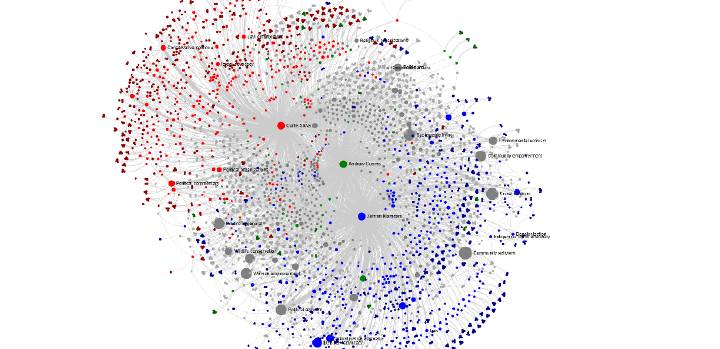
(picture 1a:general view of the graph and 1.b:when zoomed in - you can see interest namings)
To visualize the political followings of people who were followers of each candidate, a method of equal sampling of followers was applied, ensuring fair comparison between candidates. When selecting Cuomo on the graph, it is evident that interests in which he wins are extremely few, and they are often shared with Mamdani. However, even in those interests where Cuomo has an advantage, the color remains blue, indicating that more than 65% of followers of these interests belong to Mamdani.
(on those pictures you can see 2.a: selected green interests 2.b: interest with connection to Cuomo)
Such interests can be called marked for a candidate. Marked interests correlate with the fact that a person is more likely to be a follower of that candidate. In Mamdani’s case, blue marked interests demonstrate his dominance in digital space.
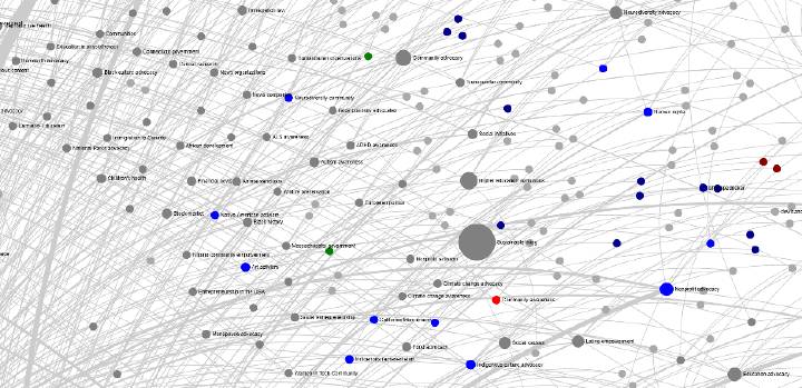
Analysis of the network graph revealed a critical difference between candidates: Andrew Cuomo literally has almost no winning interests of significant reach. Those interests in which he won are predominantly small in coverage area. At the same time, he has influence on many gray interests, such as Social Activism, but these interests remain gray, meaning not colored in his favor, since he is forced to share them with other candidates, primarily with Mamdani.
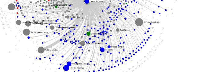
(pictures 3.a, 3.b Mamdani cluster with interests of high number and coverage)
In contrast, the analysis shows that blue clusters associated with Democratic candidates win in terms of coverage area. Large interests, such as LGBTQ+ advocacy, demonstrate significantly larger size and reach among New York residents compared to Republican clusters.
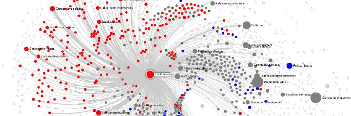 (picture 4: Sliwa cluster)
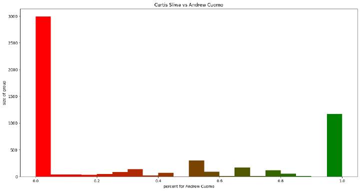
Additional analysis was conducted using histograms of preference distribution between pairs of candidates. Histograms are bar charts that display the frequency distribution of data by dividing the range of values into bins and showing the count of observations in each bin. In these histograms, the X-axis displays the percentage of marked interests per candidate, calculated as the number of interests marked by that candidate divided by the total number of interests marked by either of the two candidates. The Y-axis displays the number of people (frequency) with that percentage. For each pair, only those interests that were marked by both candidates were considered, meaning interests in which both candidates have significant representation. The histogram is drawn by counting how many people fall into each percentage bin and representing this count as the height of a bar at that position on the X-axis.
The histogram comparing Cuomo and Mamdani demonstrates total dominance by Mamdani. The graph has a pronounced U-shaped form with a strong skew toward Mamdani: the peak on the right, corresponding to 100% preferences for Mamdani, significantly exceeds the peak on the left, corresponding to preferences for Cuomo (0% for Mamdani), by approximately 10 times. This distribution shows that among those New York residents whose interests were marked by both candidates, the overwhelming majority are completely within Mamdani’s ecosystem, while only a small portion are within Cuomo’s ecosystem. The significant advantage toward Mamdani on this graph demonstrates that in terms of media, Mamdani was far ahead of Cuomo.
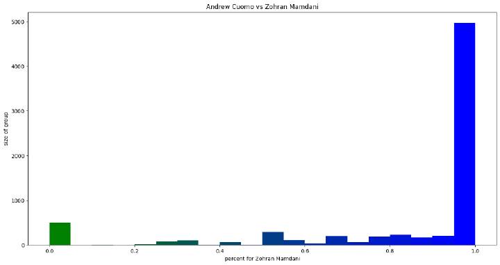
(picture 5: Cuomo vs Mamdani histogram of colored interests percentage on group with any colored interests sized 10000; Step1: find 10000 with any colored interests Step 2: remove those ones who have colored interests of only third candidate that is not on the picture)
This distribution explains why in social media, specifically in digital space, Mamdani significantly outpaced Cuomo. For many observers, Mamdani’s victory came as a surprise, yet digital data demonstrated his superiority long before election day.
Conclusions of the hypothesis
The evidence convincingly confirms the hypothesis that Mamdani’s victory over Cuomo was fully predictable based on digital data. Network analysis revealed the structural weakness of Cuomo’s position: absence of winning interests of significant reach and dependence on gray neutral topics that he could not monopolize. Histograms of preference distribution demonstrate total dominance by Mamdani in digital space, which fully corresponds to his electoral victory. These data indicate that analysis of the digital landscape of social media can serve as a more accurate tool for predicting electoral outcomes than traditional analysis methods.
Echo Chambers and U-Shaped Polarization
The hypothesis suggests that the digital political field of New York consists of isolated echo chambers, where voters rarely display mixed preferences between candidates. Instead of a normal distribution of opinions, where most people cluster around the center, the data reveal a U-shaped polarization — individuals belong almost entirely to one candidate’s ecosystem or another. This challenges the traditional idea that elections hinge on persuading undecided voters. In the digital era, elections increasingly resemble a competition to mobilize one’s own clusters and capture the zones that exist outside online discourse. These zones often consist of offline voters — people with minimal social-media presence — whose preferences remain invisible in digital analyses but can decisively shape final outcomes, as seen in Andrew Cuomo’s case.
Evidence and Analysis
Analysis of histograms of preference distribution between all pairs of candidates demonstrates a uniform picture: all graphs show a U-shaped distribution with minimal numbers of people in the central zone corresponding to mixed preferences. At the same time, in all cases there is a noticeable skew toward one of the candidates, indicating structural dominance in digital space.
 (picture 6: Sliwa vs Cuomo histogram of colored interests percentage on group with any colored interests sized 10000;
Step1: find 10000 with any colored interests
Step 2: remove those ones who have colored interests of only third candidate that is not on the picture)
(picture 6: Sliwa vs Cuomo histogram of colored interests percentage on group with any colored interests sized 10000;
Step1: find 10000 with any colored interests
Step 2: remove those ones who have colored interests of only third candidate that is not on the picture)
When comparing Sliwa and Mamdani, the distribution also demonstrates a U-shaped form with a noticeable skew toward Mamdani. On the histogram, Sliwa is represented on the left (0% for Mamdani), Mamdani on the right (100% for Mamdani). The peak on the right, corresponding to 100% preferences for Mamdani, exceeds the peak on the left, corresponding to preferences for Sliwa, by approximately 2.5 times. Although the skew in favor of Mamdani is less pronounced than in the case of Cuomo, it still demonstrates Mamdani’s superiority. The key insight is that undecided voters, meaning people with approximately equal preferences between two candidates, are practically absent for any pair of candidates. This means that the number of undecided people is very small, or undecided voters cannot be followers of even one of the marked interests, meaning their followings are apolitical.
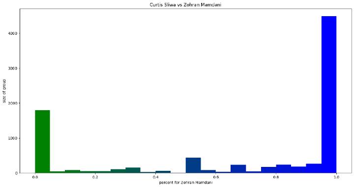 (picture 7: Sliwa vs Mamdani histogram of colored interests percentage on group with any colored interests sized 10000;
Step1: find 10000 with any colored interests
Step 2: remove those ones who have colored interests of only third candidate that is not on the picture)
(picture 7: Sliwa vs Mamdani histogram of colored interests percentage on group with any colored interests sized 10000;
Step1: find 10000 with any colored interests
Step 2: remove those ones who have colored interests of only third candidate that is not on the picture)
This distribution indicates a fundamental structural feature of digital political space: it is not a continuum where people can gradually transition from one candidate to another, but represents a set of isolated clusters, each of which completely belongs to one candidate.
An important clarification: the graphs display only those New York residents whose interests were marked by both candidates in the pair. Those who are outside political interests or whose interests are marked by only one candidate are not displayed on these graphs. This means that the total number of people not engaged in political interests may be significant, and their mobilization represents a separate task for campaigns.
Conclusions of the hypothesis
The data convincingly confirm the hypothesis that the digital field consists of isolated echo chambers with minimal numbers of undecided voters. The U-shaped distribution of preferences in all comparison pairs indicates that elections in the digital age represent not a struggle to win over the opponent’s electorate, which is practically impossible according to the data, but a mobilization race. The candidate who wins is the one who maximally mobilizes their colored cluster and more successfully captures large gray neutral clusters. This is a fundamental change in the structure of political competition, where traditional methods of persuading undecided voters give way to strategies of mobilization and capture of neutral zones.
The Mystery of Seven Percent: Hypothesis of Republican Base Compression
The hypothesis suggests that the failure of Republican candidate Sliwa, who received only 7% of the vote, cannot be explained by traditional factors such as loss of one’s own topics or inability to mobilize the base. Instead, the data indicate that the Republican base itself in New York has microscopically small reach compared to Democratic clusters.
The problem is that the histogram comparing Sliwa and Mamdani shows them as more or less equal in their loyalty bubbles, yet in reality Sliwa received only 7% of the vote, while Mamdani won. This contradiction requires explanation.
Evidence and Analysis
Analysis of the network graph of interests revealed a critical difference: the size and reach of blue Democratic clusters, such as LGBTQ+ advocacy, far exceeds the size of red Republican clusters, such as Conservative Politics. This difference in coverage area explains why even with equal loyalty in their bubbles, Democrats receive significantly greater reach. For affinitive interests on the graph, the sizes of blue interests, where size denotes coverage for New York residents, are much larger than the sizes of red interests. This shows an advantage toward Mamdani, despite the fact that at first glance in the confrontation between Sliwa and Mamdani everything may seem less obvious. Large red interests on the graph include Wildlife Conservation, Community Advocacy, Government Agencies, and Politics in General. However, the analysis shows that these interests represent rather a collection of many conservative bloggers than a broad base of support among New York residents. When analyzing gray interests associated with the Republican candidate, it turns out that they are not typically Republican. Interests such as Women Empowerment and Social Movements rather belong to the liberal agenda, and Sliwa’s connection to these topics was weak, as seen in the thinness of connections on the graph. These gray interests are not the core of the Republican base, and the candidate could not offer the neutral audience anything that would make it turn red. In contrast, Cuomo’s advantage emerged precisely in these gray interests and among offline voters — audiences not strongly tied to either ideological pole and underrepresented in social media data. By resonating with moderate and apolitical communities, Cuomo captured the segment that neither Sliwa nor Mamdani could mobilize, which ultimately secured his second-place finish.
 (picture 8: connections to grey interests, Sliwa has only upper ones)
The key insight is that the Republican did not lose his topics to Democrats in the sense that Democrats captured his interests. The graph shows that red interests remained red. But why did Cuomo still win despite having less social media reach than Silva? An additional hypothesis suggests that the election results were a consequence of strategic choices made by Republicans and social media influence. Recognizing Sliwa’s structural limitations in digital space, Republicans may have strategically directed their more mobile and extensive online base to support the centrist candidate Cuomo, hoping he could consolidate votes from both the less mobile Democratic audience outside social networks and the broader, more mobile Republican audience within social networks. This strategic redirection would explain Cuomo’s strong performance despite his weak digital presence. However, Mamdani’s influence and dominance in the digital field ultimately allowed him to secure victory. Cuomo’s effectiveness in offline campaigning and his ability to mobilize the less mobile Democratic audience outside social networks also contributed to his second-place finish. Paradoxically, it was Mamdani who was initially underestimated by traditional analysts, despite his overwhelming digital dominance that was clearly visible in social media data long before election day.
Conclusions of the hypothesis
Andrew Cuomo’s unexpected dominance among Republicans likely reflects a pragmatic anti-progressive vote: many moderate conservatives may have seen him as the only viable alternative to Mamdani, while Sliwa’s campaign appeared confined to a narrow right-wing echo chamber. Cuomo’s core supporters were reportedly older (45+) with lower social-media activity, which could explain why his strength was less visible online. Even younger users who followed Sliwa online might have viewed him as unelectable and shifted to Cuomo instead.
The Curse of Intermediacy: Structural Weakness of the Centrist Position
The hypothesis suggests that in a polarized digital political environment, an intermediate position between two polar candidates becomes both a strategic liability and a conditional advantage. Network analysis of the interest graph demonstrates that Andrew Cuomo occupies a central position between Mamdani’s blue clusters and Sliwa’s red clusters — a placement that prevents full mobilization of either polar base but allows partial absorption of voters from both sides. This duality explains why a centrist candidate may lose the race for first place yet outperform expectations by consolidating moderate and disaffected voters. Cuomo’s intermediate position makes him vulnerable from both ideological flanks but also enables him to attract disillusioned Republican voters seeking a more viable alternative and retain moderate Democrats wary of polarization.
Evidence and Analysis
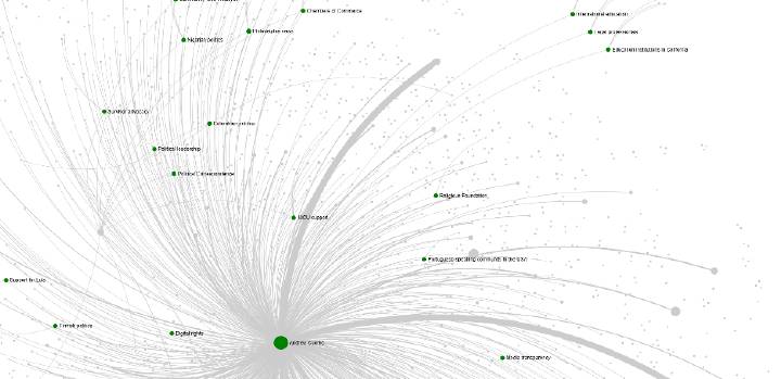
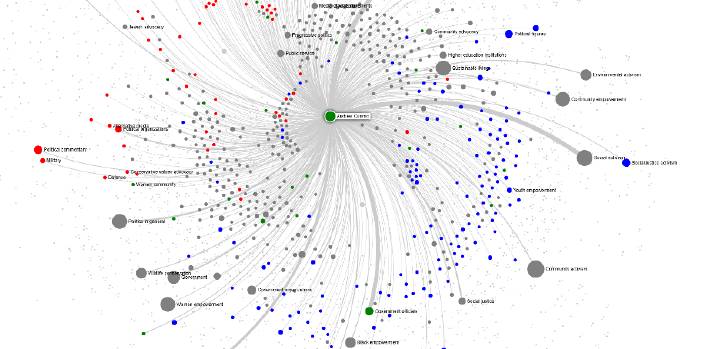
Visual analysis of the network graph of interests reveals a clear spatial structure of the political landscape. Blue nodes representing Mamdani’s interests concentrate in the left part of the graph, forming a dense cluster. Red nodes associated with Sliwa’s interests group in the right part of the graph, forming a second polar cluster. Green nodes corresponding to Cuomo’s interests are located in the central zone of the graph, between the two polar clusters, and partially overlap with gray neutral zones.
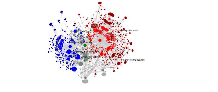 (picture 9: Middle position of Cuomo)
This spatial structure is not random but reflects fundamental differences in candidate positioning. Mamdani occupies a clear position on the left spectrum of the political field, allowing him to mobilize a large and cohesive blue cluster. Sliwa occupies a clear position on the right spectrum, ensuring loyalty to the red cluster, though with limited reach. Cuomo, positioned between them, cannot effectively mobilize either polar cluster; however, he can capitalize on voters who are unwilling to support a Republican candidate but also reluctant to align fully with Mamdani’s progressive platform. This allows him to absorb moderate and disaffected voters from both sides, transforming structural weakness into partial electoral resilience.
A critical observation is that Cuomo’s intermediate position makes him dependent on gray neutral zones that he cannot monopolize. While polar candidates have clearly defined support bases that they can mobilize, Cuomo is forced to compete for neutral zones with both opponents simultaneously. He cannot pull voters from Mamdani’s blue cluster, as they are completely within his ecosystem, and cannot pull voters from Sliwa’s red cluster for the same reason.
Additional analysis shows that Cuomo’s green nodes are often connected to gray interests that also have connections to blue and red nodes. This means that his influence extends to topics that he is forced to share with other candidates, while polar candidates have more exclusive access to their clusters.
 (picture 10: Cuomo cluster connections)
The structural weakness of the intermediate position becomes evident when analyzing preference distribution. The histogram comparing Cuomo and Mamdani demonstrates that practically no one is within Cuomo’s ecosystem among those whose interests are colored by both candidates. This indicates that the intermediate position does not create sufficient loyalty to mobilize a significant portion of the polarized electorate within social media. Its true strength lies in the gray zone — among voters who remain outside the digital echo chambers and are less visible in online political discourse, yet ultimately determine real electoral outcomes.
Quantitative analysis of political engagement levels among candidate followers provides compelling evidence for this interpretation. Analysis of equal-sized samples (n=7,000) of followers from each candidate reveals a striking pattern: Cuomo’s followers have significantly fewer political interests than followers of other candidates. The average number of political interests per follower is 53.149 for Mamdani, 43.297 for Sliwa, and only 26.932 for Cuomo—nearly half that of Mamdani’s followers. This difference cannot be explained by overall social media engagement, as the average number of total followings is remarkably similar across candidates: 1,835 for Mamdani, 1,841 for Cuomo, and 2,103 for Sliwa. Cuomo’s followers have essentially the same number of total followings as Mamdani’s followers (1,841 vs 1,835), yet they follow less than half the number of political interests (26.9 vs 53.1).
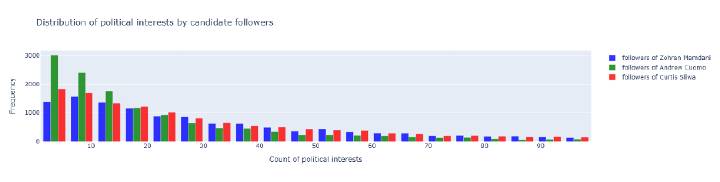 (picture 13: Distribution of political interests by candidate followers - histogram showing Cuomo’s followers have fewer political interests;
For visualization purposes, the tail of the distribution is truncated (number of political interests <= 100), the number of followers for each candidate is 14,000)
(picture 13: Distribution of political interests by candidate followers - histogram showing Cuomo’s followers have fewer political interests;
For visualization purposes, the tail of the distribution is truncated (number of political interests <= 100), the number of followers for each candidate is 14,000)
This pattern demonstrates that Cuomo’s centrist position systematically attracts voters with lower political interest and engagement—people less invested in political discourse and less committed to specific ideological positions, representing the true gray zone that exists outside the realm of high political engagement rather than between polarized positions. Because these followers do not subscribe to colored interests at the same rate as other candidates’ supporters, they are structurally harder to identify using network analysis methods that rely on colored interest affiliation. This explains the paradox of Cuomo’s electoral performance: despite receiving a significant percentage of votes in actual elections, his potential supporters appear in much smaller numbers in social media network dynamics, making his electorate fundamentally “invisible” in digital space. This invisibility means that traditional digital analysis methods, which excel at tracking highly engaged political followers through colored interests, systematically underestimate Cuomo’s electoral potential while accurately capturing the strength of candidates whose supporters demonstrate deep political engagement.
Conclusions of the hypothesis
The data confirm that the intermediate position in a polarized digital space is both strategically constrained and structurally stabilizing. Network analysis demonstrates that Andrew Cuomo occupies a central position between two polar clusters, making him vulnerable from both sides within social media ecosystems. However, this same centrality allows him to consolidate support among voters who remain outside digital echo chambers — the gray zone — which ultimately secures his electoral resilience and second-place outcome. Quantitative evidence reveals the demographic foundation of this gray zone: Cuomo’s followers have significantly fewer political interests (26.9 on average) compared to Mamdani’s (53.1) and Sliwa’s (43.3), despite similar levels of overall social media engagement. This pattern cannot be explained by following numbers, confirming that Cuomo’s centrist position systematically attracts voters with lower political interest—the very demographic that constitutes the largest and most mobile segment of the electorate. Cuomo is the undisputed king of the gray zone, drawing support from the politically disengaged who exist outside the polarized clusters of high-engagement voters. This structural difference creates a fundamental methodological challenge: because Cuomo’s followers do not subscribe to colored interests at the same rate, they are harder to identify using network analysis methods, explaining the paradox of his strong electoral performance despite appearing weak in social media network dynamics. His electorate is fundamentally “invisible” in digital space—belonging to the gray zone between polarized clusters and apolitical segments—meaning traditional digital analysis methods systematically underestimate his electoral potential while accurately capturing candidates with highly engaged supporters. This finding redefines the role of centrism in modern political competition: in the digital age, where polarization fragments the electorate into self-contained clusters, the centrist position no longer functions as a bridge between opposing sides but rather as a refuge for low-engagement voters excluded from online mobilization. The intermediate position thus becomes a structural plateau rather than a trap: it limits upward potential by preventing full mobilization of either polar coalition, yet provides a stable foundation among non-polarized, low-engagement voters who can decisively influence final election results. While the centrist position can strategically consolidate diverse voter segments, particularly those with minimal political engagement, it cannot overcome the fundamental advantage of digital dominance—the centrist’s strength lies in capturing the vast gray zone of politically disengaged voters who remain invisible in traditional digital analyses yet determine electoral outcomes.
Battle for the Gray: Rethinking the Gray Zone
The hypothesis suggests that the traditional understanding of the gray zone as neutral interests that can be colored in favor of any candidate requires rethinking. Analysis of the distribution of the number of colored interests among New York residents reveals that the true gray zone consists of people with a small number of colored interests, even if they are currently followers of only one candidate.
This hypothesis challenges the notion that the gray zone consists of people with equal preferences between candidates (50/50). Instead, it suggests that people with a small number of colored interests represent the most mobile and accessible audience for persuasion, regardless of which candidate they are currently followers of.
Evidence and Analysis
Analysis of the histogram of the distribution of the number of colored interests demonstrates a pronounced right-skewed distribution. The largest number of groups falls on people with a minimal number of colored interests (1-2), while the number of people with many colored interests is significantly smaller.
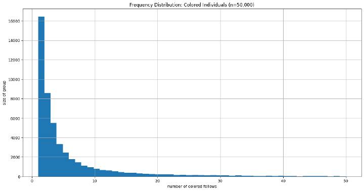 (picture 11: Histogram: number of colored interests on sample of NY city accounts with any colored interests;
For visualization purposes, the tail of the distribution is truncated: number of political interests <= 50)
(picture 11: Histogram: number of colored interests on sample of NY city accounts with any colored interests;
For visualization purposes, the tail of the distribution is truncated: number of political interests <= 50)
This distribution indicates that there are more people with just one colored interest than people with many colored interests. Those with 50/50 followings between candidates and many colored interests are indeed few—these are expressed politically interested centrists who represent an extremely rare category.
Also, we can see that the number of political interests in a random sample of accounts follows a similar trend.
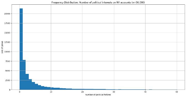 (picture 12: Histogram: number of political interests on sample of NY city accounts;
For visualization purposes, the tail of the distribution is truncated: number of political interests <= 50)
(picture 12: Histogram: number of political interests on sample of NY city accounts;
For visualization purposes, the tail of the distribution is truncated: number of political interests <= 50)
The key insight is that the true large gray zone consists of people with a small number of colored/political interests, even if they are currently followers of only one candidate. These people have weak political identification and can be persuaded toward another candidate if they are offered corresponding interests or topics. Unlike people with many colored interests, who have deep political identification and are within a strong ecosystem of one candidate, people with a small number of colored interests represent a mobile audience.
This understanding is powerfully confirmed by quantitative analysis of candidate followers: Cuomo’s followers demonstrate significantly fewer political interests (26.9 on average) compared to Mamdani’s (53.1) and Sliwa’s (43.3), despite similar overall social media engagement. This pattern reveals that Cuomo’s centrist position systematically captures the gray zone—voters with minimal political engagement who exist outside the polarized clusters of high-engagement voters. The centrist candidate becomes the natural refuge for those with weak political identification, confirming that the gray zone is not a space between polarized positions, but a demographic of low political engagement that centrists can effectively mobilize.
The distribution of colored interests reveals a critical strategic reality: people with minimal political engagement (1-2 colored interests) far outnumber those with many political interests, meaning there are indeed enough low-engagement voters to determine electoral outcomes. However, this numerical advantage comes with a fundamental challenge: these voters are significantly harder to mobilize because they lack the deep political identification and engagement that makes highly active voters responsive to traditional campaign messaging. While the gray zone represents the largest segment of the electorate, successfully mobilizing it requires different strategies than those used to activate highly engaged political followers.
This rethinking of the gray zone has important strategic implications. The battle for the gray zone should be directed not at persuading people with equal preferences between candidates (such practically do not exist), but at attracting people with a small number of colored interests, expanding the reach of existing colored interests or creating new political interests that can attract this audience.
Conclusions of the hypothesis
The data confirm the hypothesis that the traditional understanding of the gray zone requires rethinking. The true gray zone consists not of people with equal preferences between candidates (50/50), who practically do not exist among the politically interested, but of people with a small number of colored interests. These people, even if they are currently followers of only one candidate, represent a mobile audience that can be attracted by expanding the reach of existing colored interests or creating new political interests.
Quantitative evidence from candidate follower analysis powerfully supports this interpretation: Cuomo’s followers have significantly fewer political interests (26.9 on average) compared to Mamdani’s (53.1) and Sliwa’s (43.3), despite similar overall social media engagement levels. This pattern cannot be explained by followings numbers alone, confirming that the gray zone is fundamentally a demographic of low political engagement. Cuomo’s centrist position systematically captures this demographic, making him the undisputed king of the gray zone—voters with minimal political interest who exist outside polarized clusters yet can decisively influence electoral outcomes.
Expressed politically interested centrists, meaning people with 50/50 followings and many colored interests, represent an extremely rare category. This means that the traditional battle for persuading undecided voters practically does not occur among the politically interested audience. Instead, a successful campaign should be directed at attracting people with a small number of colored interests, who constitute the true large gray zone. The centrist candidate’s strategic advantage lies not in bridging polarized positions, but in systematically capturing the vast demographic of low-engagement voters who remain invisible in traditional digital analyses yet determine real electoral results.
Scorched Earth: Structural Changes in the Political Landscape
The key hypothesis suggests that the failure of the Republican candidate may be a consequence of fundamental changes in the political landscape of New York that occurred after the Trump era. The “Trump’s scorched earth” hypothesis suggests that Trump’s policies led to topics that were previously red or gray neutral becoming toxic for New York residents and either turning blue or simply disappearing from the mainstream. The Republican candidate ran on scorched earth, where his maximum reach was predetermined at 7-10% regardless of the quality of his campaign.
This hypothesis examines two time periods: the period of Trump’s elections (September 2024) and the period of New York mayoral elections (November 2025), to identify structural changes in the political preferences of New York residents.
Evidence and Analysis
To test this hypothesis, a comparative analysis of the dynamics of user migration between candidates in two time periods was conducted. The Sankey diagram visualizes the migration of followers between candidates from September 2024 to November 2025. The diagram is calculated by tracking each follower’s candidate affiliation in both time periods: a follower is assigned to a candidate based on which candidate has the majority of their colored followings (interests) at each time point. If a follower’s colored followings (interests) are predominantly associated with a particular candidate, they are counted in that candidate’s base. The width of each flow represents the number of followers migrating from one candidate to another, or leaving the political sphere entirely (categorized as “Out of candidates”).
The flow diagram tracks migration patterns among 10,000 followers of colored interests from the initial state in September 2024 to the final state in November 2025. It is important to note that if a follower has most of their colored followings (interests) associated with two candidates, they will be counted in both candidates’ bases, as the analysis focuses on colored interest affiliations rather than exclusive candidate followings. In the initial period, Mamdani had the largest support base (approximately 5,976 out of 10,000), followed by Sliwa (approximately 2,868 out of 10,000), and Cuomo had the smallest base (approximately 1,156 out of 10,000).
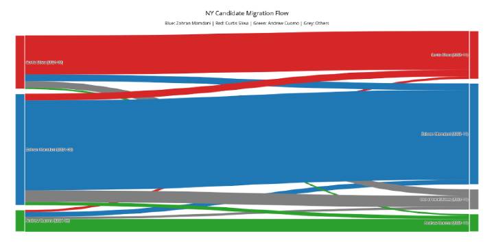 (picture 13: Sankey flow diagram: historical followings data)
A critical observation is that the red (Sliwa) and blue (Mamdani) candidates exchanged nearly equal flow sizes, despite the fact that Mamdani’s initial base was more than twice the size of Sliwa’s (approximately 5,976 vs 2,868 out of 10,000). Specifically, approximately 353 out of 10,000 migrated from Sliwa to Mamdani (representing 12.31% of Sliwa’s base), while approximately 362 out of 10,000 migrated from Mamdani to Sliwa (representing only 6.05% of Mamdani’s base). This means that the relative intensity of migration from Sliwa to Mamdani was approximately twice as high as from Mamdani to Sliwa, indicating Mamdani’s structural advantage in attracting users from the Republican base. This nearly equal exchange of flows (353 vs 362 out of 10,000), despite the significant difference in base sizes, demonstrates that users from the Republican base flow to the Democratic candidate with greater intensity than vice versa, which may indicate structural changes in political preferences.
Even more indicative is the case of the green candidate (Cuomo): he lost even more users than could be expected based on proportionality. Despite the fact that Cuomo had the smallest initial base (approximately 1,156 out of 10,000), he demonstrates disproportionately large losses. Out of his original base, only approximately 664 out of 10,000 (57.45%) remained with him, while approximately 255 out of 10,000 (22.04%) migrated to Mamdani, approximately 119 out of 10,000 (10.25%) migrated to Sliwa, and another approximately 119 out of 10,000 (10.25%) left the political sphere entirely (the “Out of candidates” category).
Key metrics for comparison include the total area of red clusters, the number of large red interests, the distribution of gray neutral zones, and their coloring dynamics. The nearly equal exchange of flows between Sliwa and Mamdani (353 vs 362 out of 10,000), despite the significant difference in their base sizes, may indicate that red clusters are losing users who flow to blue clusters, which corresponds to the hypothesis of Republican base compression.
Conclusions of the hypothesis
Analysis of the dynamics of user migration between candidates in two time periods reveals important structural patterns that support the “Trump’s scorched earth” hypothesis. The nearly equal exchange of flows between Sliwa and Mamdani (353 vs 362 out of 10,000), despite the significant difference in their base sizes (approximately 2,868 vs 5,976 out of 10,000), indicates that users from the Republican base flow to the Democratic candidate with approximately twice the relative intensity (12.31% vs 6.05%) than vice versa. This may mean that topics that were previously red or gray neutral became toxic for New York residents and turned blue.
The disproportionately large losses of Cuomo confirm the structural weakness of the intermediate position: a candidate occupying a central position between polar opponents loses users in both directions, making their position strategically losing. Out of 10,000 followers of colored interests, Cuomo’s original base was approximately 1,156, of which only approximately 664 (57.45%) remained with him, while approximately 255 (22.04%) migrated to Mamdani and approximately 119 (10.25%) migrated to Sliwa, with an additional approximately 119 (10.25%) leaving the political sphere entirely.
These data indicate that digital social media data can not only predict electoral outcomes but also identify long-term structural shifts in political preferences occurring under the influence of national politics. Analysis of migration dynamics demonstrates that structural advantages and disadvantages identified in network graphs also manifest in long-term trends of changing political preferences. This opens new possibilities for understanding how events of national scale transform local political ecosystems.
General Conclusions
This analysis reveals fundamental transformations in how electoral competition operates in the digital age. Network analysis of digital traces provides more accurate predictions than traditional polling methods—Mamdani’s victory was fully predictable from his digital dominance long before election day, yet paradoxically, it was he who was initially underestimated by traditional analysts despite overwhelming evidence in social media data.
The digital political field consists of isolated echo chambers with U-shaped polarization, where voters demonstrate virtually no mixed preferences. Elections are no longer about persuading undecided voters—who are practically absent—but about mobilizing one’s own clusters and capturing neutral gray zones. The digitally engaged electorate exists as isolated clusters, each completely belonging to one candidate rather than forming a continuum.
The digital political field consists of isolated echo chambers with U-shaped polarization, where voters demonstrate virtually no mixed preferences—elections are no longer about persuading undecided voters, who are practically absent, but about mobilizing one’s own clusters and capturing neutral gray zones. Critical structural differences determine outcomes beyond campaign tactics: Mamdani’s dominance came from large, cohesive blue clusters with extensive reach.
The “gray zone” must be redefined: it consists not of balanced 50/50 centrists, who are almost nonexistent, but of people with few or weakly expressed political interests—the largest segment of the electorate. In polarized digital environments, an intermediate position becomes both a strategic liability and conditional advantage: while centrism prevents full mobilization of either polar base online, it serves as a refuge for disengaged voters excluded from digital mobilization. Quantitative analysis confirms this pattern: Cuomo’s followers have nearly half the political interests (26.9) compared to Mamdani’s followers (53.1), despite similar overall social media engagement levels, demonstrating that Cuomo’s centrist position systematically attracts voters with lower political interest—making him the undisputed king of the gray zone. While Republicans may have strategically channeled their mobile online base toward Cuomo, this calculation could not overcome Mamdani’s fundamental digital dominance.
Long-term structural shifts reveal topics previously red or gray neutral becoming toxic and turning blue, contributing to Republican base compression, with migration dynamics showing Republican users flowing to Democratic candidates at twice the intensity of the reverse. Yet offline voters—particularly older voters (45+) with lower social-media activity—remain decisive, revealing the complex interplay between online and offline engagement. The case of Cuomo exemplifies this dynamic: his electorate, positioned between polarized clusters and apolitical segments, consists of voters with significantly fewer political interests (26.9 on average compared to 53.1 for Mamdani) who do not subscribe to colored interests at the same rate. While this makes them “invisible” in social media network dynamics, it represents a fundamental strategic advantage: people with fewer political interests constitute the largest segment of the electorate, making the gray zone not a methodological blind spot but a strategic goldmine for centrist candidates. This demonstrates that while digital analysis methods excel at tracking highly engaged political followers, the true electoral power may lie in mobilizing the low-engagement voters who exist outside the visible structures of digital political discourse.
Together, these findings indicate that elections in the digital age represent a new form of competition where structural advantages in digital space, mobilization of isolated clusters, and capture of gray zones determine outcomes more than traditional persuasion. Strategic choices can influence dynamics, but cannot overcome fundamental structural advantages. Network analysis of digital traces provides powerful tools for understanding these dynamics while revealing the complex, sometimes paradoxical relationship between online dominance and offline electoral results that shapes modern democracy.